Logo Development

This work was a rebranding journey for a recovery center in the Berkshires looking to elevate their aesthetic without losing their familiar appeal. I spearheaded this project and integrated their previous star iconography with their more contemporary chickadee icon to give them an emblem and brand package that honored their journey and encouraged flying onwards and upwards.
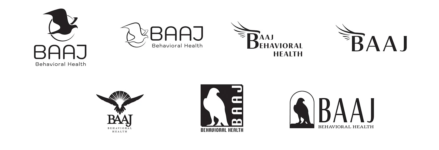
Logo first concepts pitched as my contribution to the client’s brand development with Sparrowsong Creative, who contracts me as a specialized graphic designer.

This work was a full made-from-scratch branding package for a client who had a very specific vision in mind and a reference image with a set color scheme. The client wanted a colorful and bright logo that would draw in the viewer and evoke a sense of continuity in their journey, and present professionally without the cold clinical feel.

These clients have an authentic brand with leadership that wanted something clean, natural, and refreshing. This design was one part my reference photo and vectorization, one part Sparrowsong’s intentional layout, and one part water.
Retail + Packaging

This project included designs for four iterations of package designs and tub designs. My employer was looking for something to stand off the shelves at the wholesaler, and according to our outreach coordinator, one wholesaler sold out of our product after this design hit the shelves.

This seltzer project was a great example of work where I had a higher degree of agency with the design and aesthetic, and was able to create a label that was visually appealing and compliant with packaging standards of the industry - because you don’t have to choose between form and function. Released November 2024.

Halloween Sample Pack Labels for Sunrise Gummies. This collection of labels was crafted for a limited edition special release of spooky-themed gummy sample packs, released October 2024.

These tee shirt designs were a collaborative effort between marketing and creative departments to freshen up the apparel on our shelves, released December 2024.

This photo was the result of a 24-hour mad dash from creating the labels, printing and assembling and capturing the shot, culling and editing images, and implementing an email campaign that was a last minute edition to a sale happening the following weekend.
Marketing Materials
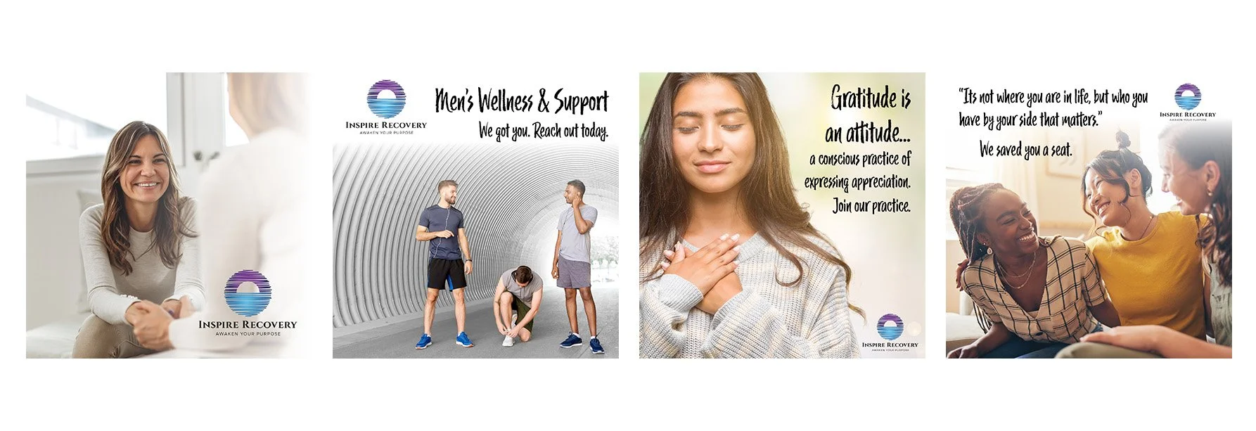
This was a short series of social media tiles created for a recovery center’s social media page. I wrote the copy and assembled the compositions.

These are three examples of 5x7 marketing cards created for clients advertising for their recovery centers.